
시작하기에 앞서, shadcn/ui로 진행하게 된 이유
shadcn/ui 가 mui보다 기능이 적어보여 고민하던 중 아래 글을 보게 되었다.
테이블을 편하게, Tanstack-table 사용하기
돌인 줄 알았는데, 금이었다.
geuni620.github.io
I Never Want to Create React Tables Any Other Way
블로그에서 소개된 영상은 shadcn/ui를 이용하면 매우 편하게 데이터테이블과 여러 기능을 추가할 수 있다는 내용이다.
이미 프로젝트에서 shadcn/ui를 사용하고 있었고, 영상에 설득되어서 바로 시작했다!
지금 작성하는 글은 공식 문서를 참고했으며 내 프로젝트에 맞게 조금씩 변형한 코드들이므로, 말그대로 기록용이다.
모두 복붙한다고 잘 동작할지 나도 모른다.
(코드는 깃허브에 있으므로 복습용, 문서화 용도의 글이다)
도움을 받고 싶은 사람들은 공식 문서의 코드를 복사하여 사용하는 것을 추천한다. (Payment 코드가 공식 예제이다.)
Data Table
Powerful table and datagrids built using TanStack Table.
ui.shadcn.com
먼저 아래 코드로 테이블을 설치했다.
npx shadcn@latest add table
npm install @tanstack/react-table
Project Structure & template code
이렇게 파일 구조를 생성하고 시작한다.
app
└── payments
├── columns.tsx
├── data-table.tsx
└── page.tsx
Next.js 형식이지만 다른 리액트 프레임워크에서도 동작한다.
columns.tsx(client component): 열 정의data-table.tsx<DataTable />(client component): 컴포넌트가 들어있는 곳page.tsx(server component): 데이터 fetch 하고 테이블을 렌더링 하는 곳
/columns.tsx
표시할 데이터, 형식 지정, 정렬 및 필터링 방법을 정의
"use client"

import { ColumnDef } from "@tanstack/react-table"

// This type is used to define the shape of our data.
// You can use a Zod schema here if you want.
export type Payment = {
  id: string
  amount: number
  status: "pending" | "processing" | "success" | "failed"
  email: string
}

export const columns: ColumnDef<Payment>[] = [
  {
    accessorKey: "status",
    header: "Status",
  },
  {
    accessorKey: "email",
    header: "Email",
  },
  {
    accessorKey: "amount",
    header: "Amount",
  },
]
/data-table.tsx
테이블을 렌더링 하기 위한 <DataTable /> component 생성
"use client"

import {
  ColumnDef,
  flexRender,
  getCoreRowModel,
  useReactTable,
} from "@tanstack/react-table"

import {
  Table,
  TableBody,
  TableCell,
  TableHead,
  TableHeader,
  TableRow,
} from "@/components/ui/table"

interface DataTableProps<TData, TValue> {
  columns: ColumnDef<TData, TValue>[]
  data: TData[]
}

export function DataTable<TData, TValue>({
  columns,
  data,
}: DataTableProps<TData, TValue>) {
  const table = useReactTable({
    data,
    columns,
    getCoreRowModel: getCoreRowModel(),
  })

  return (
    <div className="rounded-md border">
      <Table>
        <TableHeader>
          {table.getHeaderGroups().map((headerGroup) => (
            <TableRow key={headerGroup.id}>
              {headerGroup.headers.map((header) => {
                return (
                  <TableHead key={header.id}>
                    {header.isPlaceholder
                      ? null
                      : flexRender(
                          header.column.columnDef.header,
                          header.getContext()
                        )}
                  </TableHead>
                )
              })}
            </TableRow>
          ))}
        </TableHeader>
        <TableBody>
          {table.getRowModel().rows?.length ? (
            table.getRowModel().rows.map((row) => (
              <TableRow
                key={row.id}
                data-state={row.getIsSelected() && "selected"}
              >
                {row.getVisibleCells().map((cell) => (
                  <TableCell key={cell.id}>
                    {flexRender(cell.column.columnDef.cell, cell.getContext())}
                  </TableCell>
                ))}
              </TableRow>
            ))
          ) : (
            <TableRow>
              <TableCell colSpan={columns.length} className="h-24 text-center">
                No results.
              </TableCell>
            </TableRow>
          )}
        </TableBody>
      </Table>
    </div>
  )
}
/page.tsx
import { Payment, columns } from "./columns"
import { DataTable } from "./data-table"

async function getData(): Promise<Payment[]> {
  // Fetch data from your API here.
  return [
    {
      id: "728ed52f",
      amount: 100,
      status: "pending",
      email: "m@example.com",
    },
    // ...
  ]
}

export default async function DemoPage() {
  const data = await getData()

  return (
    <div className="container mx-auto py-10">
      <DataTable columns={columns} data={data} />
    </div>
  )
}
셀 형식 지정(Cell Formatting)
export const columns: ColumnDef<Payment>[] = [
  {
    accessorKey: "amount",
    header: () => <div className="text-right">Amount</div>,
    cell: ({ row }) => {
      const amount = parseFloat(row.getValue("amount"))
      const formatted = new Intl.NumberFormat("en-US", {
        style: "currency",
        currency: "USD",
      }).format(amount)

      return <div className="text-right font-medium">{formatted}</div>
    },
  },
]
이런 식으로 셀과 헤더형식을 지정할 수 있다.
여기서 헤더는 열 제목.
셀 형식 - 통화 형식 지정
 cell: ({ row }) => {
      const amount = parseFloat(row.getValue("amount"))
      const formatted = new Intl.NumberFormat("en-US", {
        style: "currency",
        currency: "USD",
      }).format(amount)

      return <div className="text-right font-medium">{formatted}</div>
    },
Intl.NumberFormat("en-US", options).format(number): 숫자 형식에 맞는 자릿수 포맷을 적용- 한국 돈으로 지정시 3자리마다 쉼표 찍히게 출력됨
        style: "currency",
currency: "krw",parseFloat(): 문자열을 부동소수점 숫자로 변환row는 데이터 행 객체로 간주getValue("amount"):amount열의 값을 가져옴
셀 형식 - 시간 형식 지정
{
        accessorKey: "tradeTime",
        header: "tradeTime"
        cell: ({ row }) => {
            const tradeTime = new Date(row.getValue("tradeTime"))
            const formatted = new Intl.DateTimeFormat("ko-KR", {
                dateStyle: "medium",
                timeStyle: "short",
                hour12: false,
            }).format(tradeTime)

            return <div className="text-start font-medium">{formatted}</div>
        },
    },
Intl.NumberFormat("ko-KR", options).format(number): 2023. 12. 4. 12:00hour12: 12시간 형식 (오전, 오후 구분)- dateStyle, timeStyle: 표시 형식 길이 지정 ( 시분초표시, 시분까지표시, 등등)
new Intl.DateTimeFormat('en', { dateStyle: "medium", timeStyle: "medium" }).format(new Date())
// => "Nov 26, 2020, 4:52:55 AM"
참고자료
[JavaScript] Intl.NumberFormat 객체
For JavaScript's toLocaleDateString, are there new standards to replace dateStyle and timeStyle?
페이지네이션 (Pagination)
/data-table.tsx
import {
  ColumnDef,
  flexRender,
  getCoreRowModel,
  **getPaginationRowModel,**
  useReactTable,
} from "@tanstack/react-table"

export function DataTable<TData, TValue>({
  columns,
  data,
}: DataTableProps<TData, TValue>) {
  const table = useReactTable({
    data,
    columns,
    getCoreRowModel: getCoreRowModel(),
    **getPaginationRowModel: getPaginationRowModel(),**
  })

  // ...
}
위 코드 추가
이렇게 하면 행이 자동으로 10페이지로 페이지화 된다.
행 갯수를 변경하는 기능은 shadcn에서 기본 제공하지 않으므로 tanstack문서를 보고 커스텀 해봐야겠다.
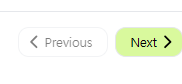
페이지 컨트롤 버튼 🔽
<div className="flex items-center justify-end space-x-2 py-4">
        <Button
          variant="outline"
          size="sm"
          onClick={() => table.previousPage()}
          disabled={!table.getCanPreviousPage()}
        >
          Previous
        </Button>
        <Button
          variant="outline"
          size="sm"
          onClick={() => table.nextPage()}
          disabled={!table.getCanNextPage()}
        >
          Next
        </Button>
      </div>
    </div>
여기서 shadcn/ui의 버튼 컴포넌트를 설치해도 되지만, 템플릿 사용을 덜 하고싶어서 Button 컴포넌트 코드를 작성해서 넣었다.
참고자료
효율적이고 최적화된 Next.JS 재사용 가능한 컴포넌트 만들기
import cn from "clsx"
import { ButtonHTMLAttributes } from "react"

interface ButtonProps extends ButtonHTMLAttributes<HTMLButtonElement> {
    className?: string
}

const Button = (props: ButtonProps) => {
    const { className, ...rest } = props
    return (
        <button
            {...rest}
            className={cn(
                className,
                "flex items-center justify-center rounded-xl border p-1 text-sm font-medium disabled:pointer-events-none disabled:opacity-50",
            )}
        >
            {props.children}
        </button>
    )
}

export default Button
그리고 lucide-react 라이브러리를 이용해 페이지 컨트롤 버튼도 커스텀해보았다.
오름차순, 내림차순 정렬 (Sorting)
/data-table.tsx
"use client"

**import * as React from "react"**
import {
  ColumnDef,
  **SortingState,**
  flexRender,
  getCoreRowModel,
  getPaginationRowModel,
  **getSortedRowModel,**
  useReactTable,
} from "@tanstack/react-table"

export function DataTable<TData, TValue>({
  columns,
  data,
}: DataTableProps<TData, TValue>) {
  **const [sorting, setSorting] = React.useState<SortingState>([])**

  const table = useReactTable({
    data,
    columns,
    getCoreRowModel: getCoreRowModel(),
    getPaginationRowModel: getPaginationRowModel(),
    **onSortingChange: setSorting,
    getSortedRowModel: getSortedRowModel(),
    state: {
      sorting,**
    },
  })

  return (
    <div>
      <div className="rounded-md border">
        <Table>{ ... }</Table>
      </div>
    </div>
  )
}
/columns.tsx
**import { ArrowUpDown } from "lucide-react"**

//생략
{
        accessorKey: "tradeTime",
        header: **({ column }) => {
            return (
                <div className=" ">
                    <Button
                        className="border-none hover:bg-gray-200"
                        onClick={() => column.toggleSorting(column.getIsSorted() === "asc")}
                    >
                        tradeTime
                        <ArrowUpDown className="ml-2 h-4 w-4" />
                    </Button>
                </div>
            )**
        },
추가하면 내림차순, 오름차순으로 정렬할 수 있다.

이제 필요한 용도에 맞게 데이터를 수정해보았다.
데이터를 수정하기 편하게 data.tsx와 data-table을 분리했다.
Project Structure 수정
app
└── trading-table
├── columns.tsx
├── data-table.tsx
├── data.tsx
└── page.tsx
columns.tsx(client component): 열 정의data-table.tsx(client component):<DataTable />컴포넌트가 들어있는 곳page.tsx(server component): 데이터 fetch 하고 테이블을 렌더링 하는 곳data.tsxFetch data from your API here.
import { EnergyTrade } from "./columns"
async function getData(): Promise<EnergyTrade[]> {
    // Fetch data from your API here.
    return [
        {
            id: "trade001",
            tradeTime: "2023-12-04 12:00",
            plantName: "서울 발전소",
            volume: "500",
            bidPrice: "70",
            matchingStatus: "matched",
        },
    // 임시로 생성한 mock데이터
    ]
}

export default getData
import { columns } from "./columns"
import { DataTable } from "./data-table"
import getData from "./data"
export default async function DemoPage() {
const data = await getData()
return (
<div className="container mx-auto py-10">
<DataTable columns={columns} data={data} />
</div>
)
}
오늘은 여기까징
드롭박스나 인풋컴포넌트(서치)기능이 필요해서 필터, 검색 기능은 다음주에 계속
참고로 공식 문서에서 Row Actions가 조건에 맞는 열만 보여주는 필터 기능이고 Filtering이 키워드 서치 기능이다.

shadcn/ui
Beautifully designed components that you can copy and paste into your apps. Accessible. Customizable. Open Source.
ui.shadcn.com
https://github.com/shadcn-ui/ui/tree/main/apps/www/app/(app)/examples/tasks
ui/apps/www/app/(app)/examples/tasks at main · shadcn-ui/ui
Beautifully designed components that you can copy and paste into your apps. Accessible. Customizable. Open Source. - shadcn-ui/ui
github.com
이렇게 좋은 템플릿 코드가 다 업로드되어있다는 사실은 이제 알게됐다..사실 구현 직접 할 필요 없는 정도
하나하나 구현해보는 것도 나쁘지 않은 경험인 것 같으니 계속해봐야겠다 !
shadcn은 아니지만 리액트 테이블 만들 때 참고할만한 영상
React Data Table with Search, Sort, Pagination and Filter